Data Concepts Made Simple
These stories demystify technical concepts and data terms using real-life situations – though de-identified because, well, privacy. We’ll add one every so often, so please check back or sign up for our newsletter so we can let you know we’ve published a new story.

Should we look at data by race/ethnicity or place?
Spoiler alert: both.
But one interesting question we get is why we push the place lens, not just the race/ethnicity lens, as a way to see #inequity clearly. The degree of difference is masked or washed out in the race/ethnicity breakout.
An easy example is median household income (from all sources, not just wages). That’s about $53K for Bexar County overall. “Median” is the halfway break point – half of county households have income higher than $53K and half have income lower. So median ~$53K for the county overall, ~$45K-$46K (which is 86% of $53K) for Hispanic and Black households, and ~$70K (132% of $53K) for Non-Hispanic White households. And 86% vs. 132% of county median is a big variation, for sure.

The neighborhood that eliminated asthma?
A community asthma coalition wanted to see what parts of the county had the worst problem with serious asthma among children. They mapped by zip code the total number of child asthma-related hospitalizations in the past year, because hospitalizations are a commonly-used measure of asthma that is uncontrolled. One zip code, actually a small city within the larger city, really stuck out on the map – it had only a handful of child asthma hospitalizations. The coalition’s planning committee was very curious how this city had managed to bring child asthma under such good control that hospitalizations were rare, and the committee proposed talking to that city’s leadership to learn more and hopefully transfer successful practices to the surrounding area.
When the committee presented the map to the full coalition, though, one member pointed out something the planning committee hadn’t thought of: the city with the very small number of child hospitalizations has a very old population compared to surrounding areas. There are very few child asthma hospitalizations in that zip code because there are actually very few children at all. Once the committee mapped the rate – number of child asthma hospitalizations per 1,000 children – instead of the raw number of hospitalizations, that zip code didn’t look any better than the others.
Key point: different geographic areas – for example, zip codes or counties – have different population sizes and characteristics. So if you want to compare and contrast something across geographic areas, you usually want to compare a rate per population, not a number of events or cases, for a specific period of time. To calculate a rate, divide the number of events or cases, like child asthma hospitalizations, by the number of people who could have had an event or case during the time period. When calculating a rate, we generally multiply by a factor of 100 – 100, 1,000, 10,000, or 100,000 – to get a number that’s not a fraction and is easier to look at. Use the same multiplier for every geography you’re comparing.
Example: Zip code #1 had 22 child asthma hospitalizations in 2014, and a total of 1337 children lived there in 2014; dividing 22 by 1337 gives us 0.01645. Zip code #2 had 14 child asthma hospitalizations among a total of 1051 children in 2014, or 0.01332 hospitalizations per child. Multiply by 1,000 children to get a rate of 16.5 asthma hospitalizations per 1,000 children in zip code #1, and a rate of 13.3 asthma hospitalizations per 1,000 children in zip code #2.These two zip codes can now be compared directly, and we can tell that child asthma hospitalizations are a bigger problem in zip code #1 than in zip code #2.
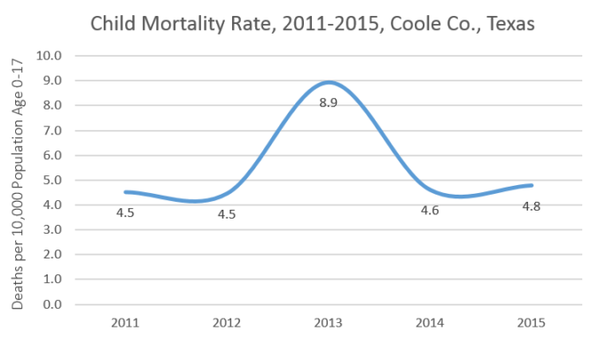
The Tragic Coole County School Bus Crash of 2013?
A well-regarded national firm was working on a community health needs assessment for a community-hospital coalition in rural Coole County, Texas, charged with identifying trends over time and comparing Coole to other similar counties. They were reviewing the data in their weekly meeting and child deaths came up on the agenda. Knowing how important it is to calculate a rate to get an apples-to-apples comparison, one team member had calculated the five-year trend in the mortality rate, or number of deaths per year per 10,000 people 17 and younger. Like the comparison counties, Coole County’s child mortality rate was reliably very low every year – with the exception of a huge spike in 2013. The team, all of whom actually lived 2,000 miles away from Coole County, speculated about what might have caused such a massive one-time increase – there must have been something like a terrible school bus crash that killed many kids all at once. Before moving on in their agenda they made a note to ask Coole County stakeholders about it at their next meeting.
In the meantime, a curious junior staff member searched the web for news about the deaths and found nothing, so she went back and looked at the raw data to see how many kids actually died that year. To her surprise she discovered that it was a whopping two. But because there was only one child death in each of the other years in the trend and not much change in the size of the child population, the rate of child deaths doubled for 2013. She took that information back to the team, which elected to present both the number and rate for every year and skip the embarrassing question to Coole County.
Key point: because population sizes and characteristics are different for different areas and can change for a single area over time, it’s smart to calculate a rate per population to control for those differences and changes. But don’t forget the importance of also showing the actual number of events or cases, especially when the numbers are very small and can result in huge swings in the rate. (We call that a “volatile” or “unstable” rate.)
Contact
We Want to Meet You!
Connect with us at CINow to explore the endless ways data can make communities stronger. Whether you have questions, ideas, training needs, or a potential partnership in mind – we’re happy to hear from you!