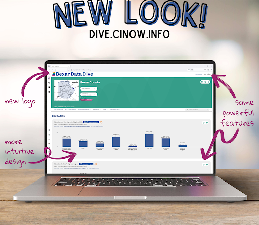
Bexar Data Dive has a fresh new interface! All the features you’re familiar with are still there and still work the same way, but we collaborated with The Mighty Group to redesign the site’s look and feel. Take a look around and let us know what you think!
The new design uses icons consistently through the site to help you quickly see and access features like the pop-up indicator definition in this bar chart of ‘Not in labor force’ by race/ethnicity for SSA 5.

You may have noticed that the bar chart above looks different in another way, too – each blue bar has a thin vertical line. Data Dive now allows you to see the range of the margin of error (MOE) graphically instead of solely as numbers. Wherever the data is an estimate rather than a count, MOE tells you how trustworthy and certain the estimate is. We can be confident the true value lies somewhere in the MOE range, but if that range is really big – for example, the MOE for the American Indian or Alaska Native estimate – we shouldn’t put much stock in that estimate. MOE is shown as an error bar in bar charts, as shown above, and as an error band in line charts trending the data over time. All the actual numbers are all still there, though – just click “Labels” instead of “MOE lines” to see them.