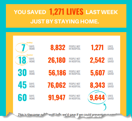
March 25 – the day the “stay at home” order went into effect in San Antonio and Bexar County – was only a week before this infographic, but the cost already felt unbearably high. Sometimes it’s hard to trust that it’s worth the price we’re paying. We used epidemiologists’ COVID-19 models to put numbers to the hospitalizations and deaths in Bexar County that can be prevented between then (March 2020) and October (2020) by our staying home.
We know, though, that staying home is made possible by a privilege that too many of our neighbors don’t have. They have no home at all, nor any shelter that can truly shield them from infection. They have a home but it isn’t safe because of family violence or very poor housing conditions. They don’t have internet that would allow them to work from home, or their job is in a hospital, a grocery, or other essential setting.
We also know that staying home is not enough if we can’t identify people with infection and house them safely and separately until they recover. With most infections causing mild symptoms or no symptoms at all, widespread testing is critical to finding those infections, and we just didn’t yet have the supplies we needed to do that testing.
So we offered this infographic painfully aware that it can’t tell the whole story or predict every possible future, nor can it ease any economic or personal hardships. We hoped, though, that it would help us all remember that of the few truly terrible choices available to us at this moment in history, the one we’ve made is – by far – the least terrible.
We thank CINow Board member Dr. Vince Fonseca, MD, MPH, FACPM for his technical consultation on the analysis behind this infographic.


