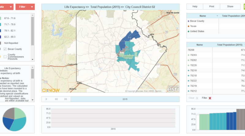
Viz-a-lyzer introduction and help

CI:Now’s new Viz-a-lyzer is an interactive tool for people to visually explore and analyze (visual… viz… viz-a-lyze… get it?) Bexar County data by zip code tabulation area and year, with comparisons to Bexar County, Texas, and the United States where available. We’ll be adding new indicators and features several times a year – subscribe to our newsletter to hear when a new release is out. View the June 2021 Release Notes to see the latest updates, additions, and improvements.

Here are some of the Viz-a-lyzer‘s key features:

+ Maps key indicators by zip code area
+ Charts a five-year trend line where available
+ Spits out an image you can drop directly into your grant or strategic plan
+ Shows you which zip codes are best and worst for a given indicator
+ Gives you county and state benchmark data where available
+ Lets you filter by school district, county precinct, or city council district

There’s a lot of stuff going on on that screen. Where do I start?

Below is an introduction to each part of the Viz-a-lyzer – what it tells you and how to use it. If this is all old hat to you, just head on over to viz.cinow.info and start exploring.

The Basics

Everything’s linked. Every part of the Viz-a-lyzer is linked, so once you’ve chosen an indicator from the Data Chooser, every part of the screen is showing that indicator. And once you’ve clicked on a zip code in any part of the screen, that zip code is highlighted in every other part of the screen.

Clear and Filter. The “Clear X” button will clear any zip code selection you’ve made. The “Filter X” button will clear any filter selection you’ve made.

Download. See the small gray down arrow at the top right of the map, right of the “Total Population (2015)” text? That down arrow will appear if you hover your cursor at the top right of any part of the screen. Click it and you’ll get download options specific to that part of the screen.

Pop out. See the small diagonal arrow right next to the Download button? That diagonal arrow will appear if you hover your cursor at the top right of any part of the screen. Click it and that part of the screen will “pop out” and expand to full screen. Click it again to go back to the normal view.

About ZIPS, ZCTAs, and their relationship to other local boundaries.  The indicator data is aggregated by ZCTA, which is commonly but not really accurately called a zip code for short. Neither ZIP codes nor ZCTAs have any relationship at all to Census divisions (tracts, block groups) or to jurisdictional divisions like City Council Districts, County Commissioner Precincts, school districts, election precincts, or state or national legislative districts. That means that ZCTA boundaries will never match up with any of those other geopolitical boundaries. Read more here about how the Viz-a-lyzer deals with that mismatch.


Data Chooser

The Data Chooser is the menu from which you choose the indicator you want to see. If you don’t choose anything, the view will default to Total Population. Many indicators are available for subcategories – age groups, race/ethnicity groups, and so forth.

1. Click the red “Data” button to see the indicator list
2. Click any right arrow (sideways triangle) to expand the subcategories
3. It’s a long list, so don’t forget to scroll down!


Filter Chooser

The Filter Chooser lets you simplify your view if you’re only interested in what’s going on in one part of the county. For example, maybe you’re only interested in the San Antonio Independent School District area. Selecting it in Filter will hide all the zip codes/ZCTAs that don’t have any meaningful overlap with that school district. (The school district boundaries and filtered zip code/ZCTA boundaries won’t match up – read more here.)

1. Click the red “Filter” button to see the list of available filters
2. Click any right arrow (sideways triangle) to expand the subcategories
3. Choose the filter you’re interested in
4. Remember to click “Filter X” to clear the filter and view the whole county again


Year Chooser

The  Year Chooser lets you show what year of data you want to see. Because all parts of the visualization are linked, whichever you select will be what shows in every part of the screen except the line chart. The line chart show all five years of data (if available) for whichever zip code you’ve selected. If you haven’t selected one, no data will graph on the line chart.

Press Play. If you press the gray arrow at the far left of the Year Chooser, the map series will animate and move continuously among all years.

First/Last Year. The left-pointing double-arrow takes you to the earliest or first year in the series. The right-pointing double-arrow takes you to the most recent or last year in the series.


Legend, Boundaries, and Notes

The legend is the key to interpreting the color-coding in all parts of the visualization. Again, everything’s linked, so if a zip code is in the purple category in any part of the screen, it’s in the purple category in every part of the screen.

Click on a color. If you click a color or data category in the legend, all the zip codes in that category will highlight in every part of the screen. (Remember to hit Clear to go back to normal view.)

Show/hide boundaries. The check boxes in the legend allow you to show or hide the boundary lines of Bexar County, local school districts, and county commissioner precincts. (City Council District boundaries coming soon.) Unlike the filter, you’re just showing the boundaries of all the geopolitical units, like school districts, not restricting the data view to a single school district.

Notes. The notes box shows you the definition of the indicator you’ve selected, the data source, and other information to help you understand what you’re looking at.

Too small? Remember that you can hit the gray arrow at the top right of the legend and notes boxes to expand the legend to full screen. Click it again to leave full-screen mode.


 Map

The map’s really the heart of the entire screen, because most of us find a map easier to look at than a data table or a histogram. The map shows  you geographic patterns for the indicator you’ve chosen.

Title. The map title will always display the indicator you’ve chosen to view.

Hover on a zip code. Hovering your cursor over any zip code will show you the name of that zip code and the data value or estimate for the indicator you’ve chosen. If you’ve chosen an indicator that comes from a survey, it’ll be an estimate with a margin of error. That margin of error is very important but it shows in the histogram, not on the map.

Click a zip code. Click on a zip code in the map (or the data table) to highlight that zip code throughout the screen.

Zoom in and out. Use the “+” and “-” magnifying glasses to zoom in or zoom out on the map. The more you zoom in, the more detail you’ll see through the map colors, like streets and rivers.

Reset the zoom. If you’ve zoomed in or out and want to go back to the original view, just click the four-arrow icon to the left of the magnifying glass zoom buttons.

Clear and Filter.  Don’t forget to hit “Clear X” to un-select all zip codes and “Filter X” to remove your filters and take you back to normal view.


Pie Chart

The pie chart shows you at a glance roughly what proportion of zip codes fall into each category in the legend.

Hover on a slice. Hovering your cursor over a slice of the pie chart shows you the range of data values for that category, and in parentheses the number of zip codes that fall in that category for that indicator and year.

Click a slice. Click on a slice of the pie chart to highlight that category of zip codes throughout all parts of the screen, as well as graph each of those zip codes’ trend lines in the Time Trend line chart.

Clear and Filter.  Don’t forget to hit “Clear X” to un-select your slice and “Filter X” to remove your filters and take you back to normal view.


Time Trend

The Time Trend line chart displays the data value, if available, for all five years for the indicator and zip code you’ve selected. If you haven’t selected a zip code or color category somewhere on the screen, the line chart will be empty.

Hover on a data point. Hovering your cursor over any data point (dot) in the line chart will show you the data value or estimate for that zip code and year.


Histogram

The histogram may not make much sense at first glance, but it may become your favorite tool! It’s just a bar chart, where each bar is a zip code and they’ve been automatically sorted from lowest to highest value on the indicator you’ve selected. You can tell at a glance whether very many or very few zip codes fall into a particular color band in the Legend.

Margin of error.  If you’ve chosen an indicator that comes from a survey, it’ll be an estimate with a margin of error. That margin of error is very important and this is the only place on the screen where you can easily see how wide the margin of error is for each zip code all at once. It shows up as a gray vertical line at the top of each bar. The longer the vertical line, the wider the margin of error, and the less certain the data source is – and the less certain you should be – about the estimate. Think of it as a “grain of salt”-o-meter.

Hover on a zip code. Hovering your cursor over any zip code will show you the name of that zip code and the data value or estimate for the indicator you’ve chosen, along with the margin of error if there is one. The estimate will show as a number as a number right beside the zip code name. The margin of error ranges from the “LL” (lower limit”) to the UL (“upper limit”).

Click a zip code. Click on a zip code to highlight that zip code in the histogram and throughout the screen.

Clear and Filter.  Don’t forget to hit “Clear X” to un-select all zip codes and “Filter X” to remove your filters and take you back to normal view.


Data Tables

The data tables are where you’ll find the actual data value (or estimate and margin of error, if the data comes from a survey) for each zip code, along with the values for Bexar County, Texas, and the United States if a true apples-to-apples comparison is available. The geography is in the left column and data values/estimates are in the right column.

Title. The header of the right column of either table tells you what indicator and  year you’re looking at.

Sort by zip code. Clicking on the “Name” (left) column header will sort the zip codes on the zip code name, from smallest to largest. Clicking on it again will sort by name from largest to smallest.

Sort by value. Clicking on the right (indicator title) column header will sort the zip codes by value, from smallest to largest. Clicking on it again will sort by value from largest to smallest.

Hover on a zip code. Hovering your cursor over any zip code will highlight that zip code in every part of the screen.

Click a zip code. Clicking on a zip code will highlight that zip code throughout the screen and zoom into it on the map.


Help, Print, and Share

Help. The help button takes you to the generic help document for the application used to build the Viz-a-lyzer.

Print. Clicking the Print button will open the entire visualization as a “print preview” in a new browser tab or window, resizes to an A4 size and landscape orientation. See the small gray print menu buttons right above the visualization? You can make the visualization larger or smaller using the “+” and “-” buttons and select your printer with the printer icon.

Share. The Share button lets you email a link to the Viz-a-lyzer or even embed it in your webpage. (Please contact us if you want to embed it in your site.)


Thanks to our Funders and Partners

Many thanks to The Health Collaborative and the Kronkosky Charitable Foundation for the investments that allowed us to build the Viz-a-lyzer. Thanks also to SA2020, The Nonprofit Council, The Health Collaborative’s Data Committee and staff, and the nonprofits that tested an early version to help us make sure we were building a tool that meets local need.